Introducing Quantivate’s New User Interface
- May 8, 2019
- Quantivate
Upgrading your GRC management experience
Quantivate is pleased to announce some exciting news: a new version of our software’s user interface (UI) will be released later this month. This upgrade will bring significant improvements to the Quantivate risk and compliance management platform, including:
- A clean, modern design that provides easy access to tools and data
- A streamlined menu layout for fast, fluid navigation
- Dashboard enhancements that maximize productivity and simplify task flows
Benefits and Features
Boost efficiency with a new menu structure and enhanced navigation.
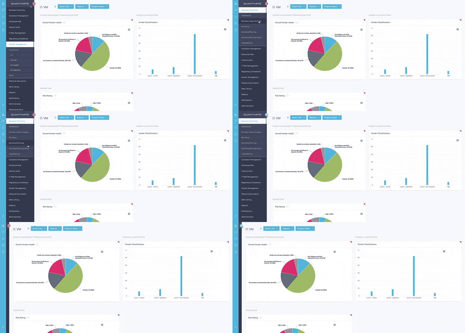
Our new menu gives users an at-a-glance view of their access to software modules, reports, and settings. The drop-down structure expedites task management and helps users quickly find what they’re looking for. Additionally, common functions like alerts, tasks, and search are always accessible right from the menu, no extra navigation required.

Feature Highlight: Streamlined Menu
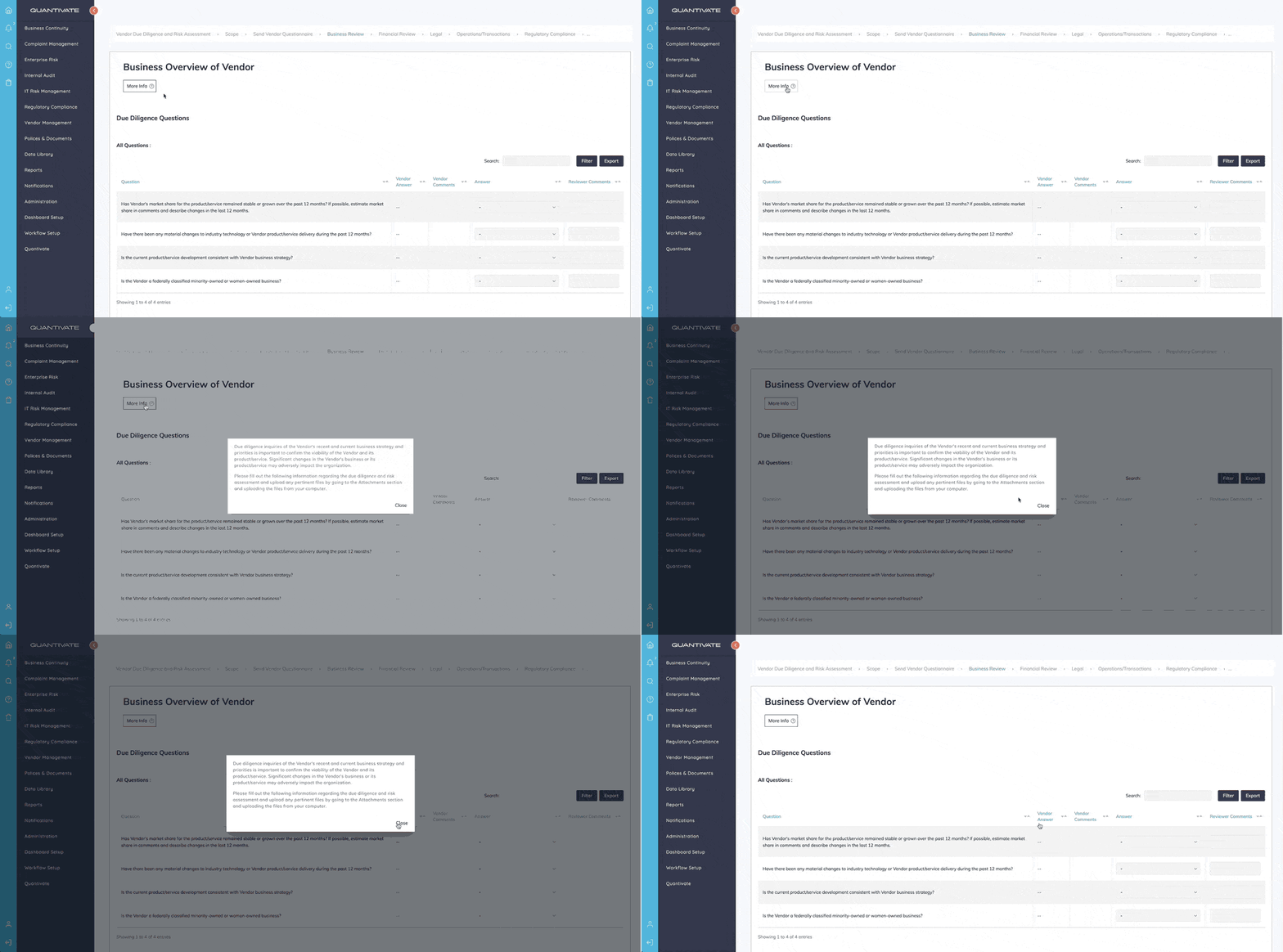
Another upgrade included with the new UI enables the addition of help text within the software. This option gives organizations the ability to encourage efficient usage and consistent procedures by adding specific instructions or explanations to section titles. Paired with streamlined navigation, this feature also equips novice users to quickly get up to speed.

Feature Highlight: Help Text
Take charge of your workspace with custom widgets and flexible viewing options.
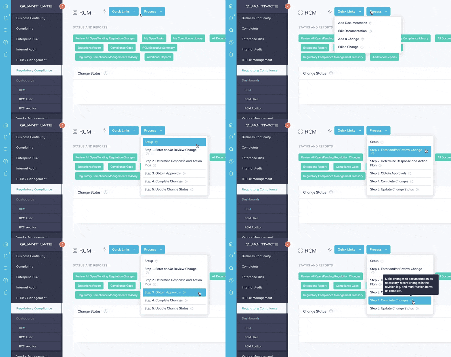
Users can now customize dashboards to improve task flow and maximize productivity. Quick links, a new widget category, can be added to any dashboard and link to any task, item, or location within the software. Create shortcuts to activities you perform regularly, reports you need to run, or even external resources. This new feature cuts down on time spent task-switching and keeps common functions close at hand.

Feature Highlight: Quick Links
The updated design also gives users more options for arranging and viewing their workspace. Slide away the menu to focus on your dashboards or expand charts and tables to full screen width for distraction-free analysis.
When is the new UI available?
The new UI will be released on May 29, at which point customers can choose when and where to activate it within their software setup. Customers will also receive an email invitation to a webinar demonstrating the interface (also on May 29), which will include a brief tutorial on how to get started using the updated UI. In the meantime, get a more detailed preview of the enhancements coming your way at our UI overview page.
Not a Quantivate customer but interested in the improvements? Be one of the first to see the new UI in action — request a demo here, and make sure to leave a note mentioning the new UI in the “Additional Comments” section.